
Challenge
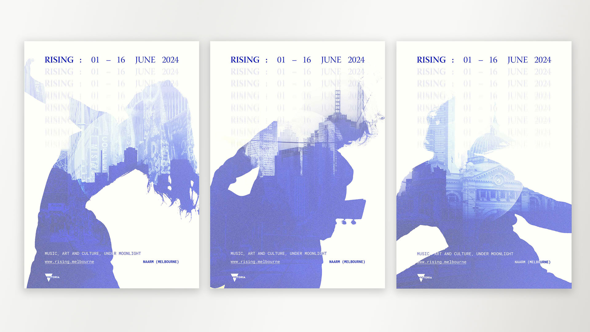
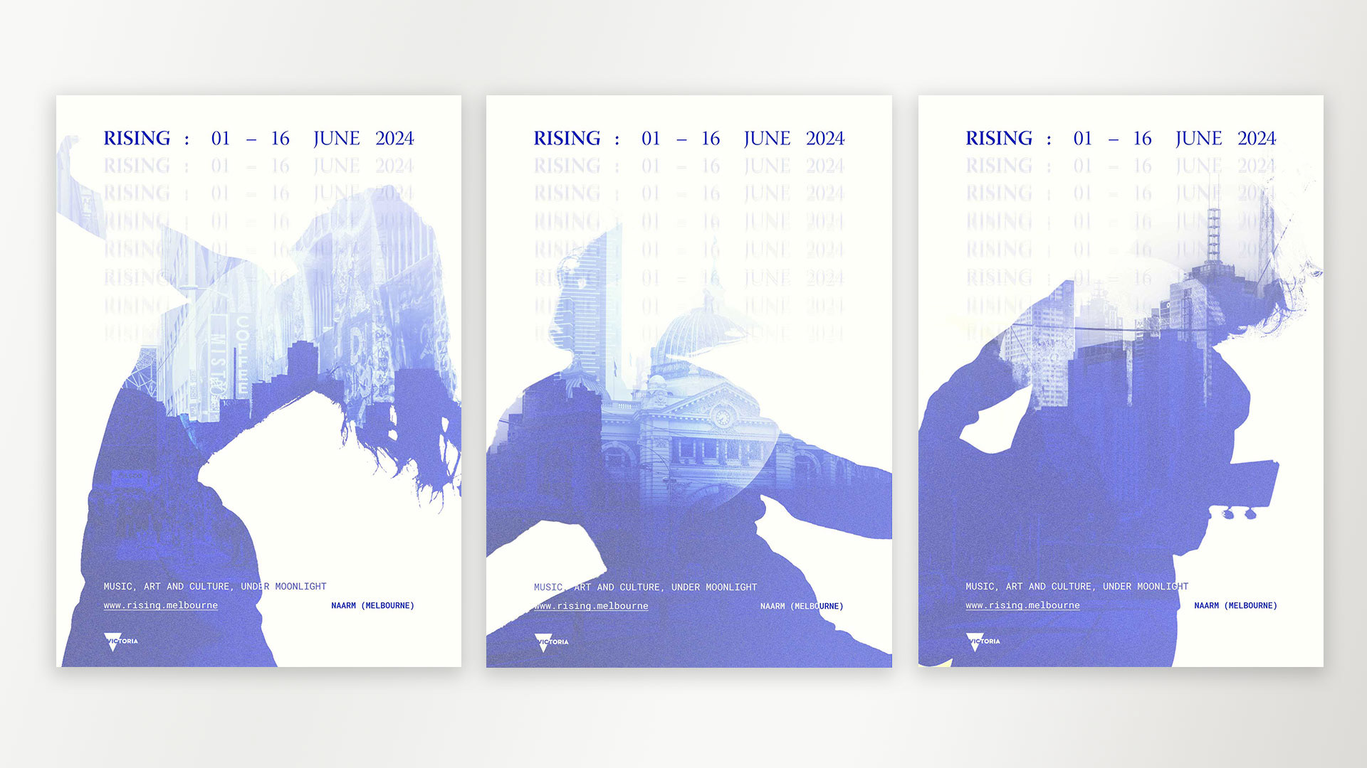
Early this year, the RISING Festival inspired me with its eclectic collection of visual art, city installations, performances, and live music. This project is a generic poster series for the 2024 festival, as the acts are unconfirmed at the time of designing.
Execution
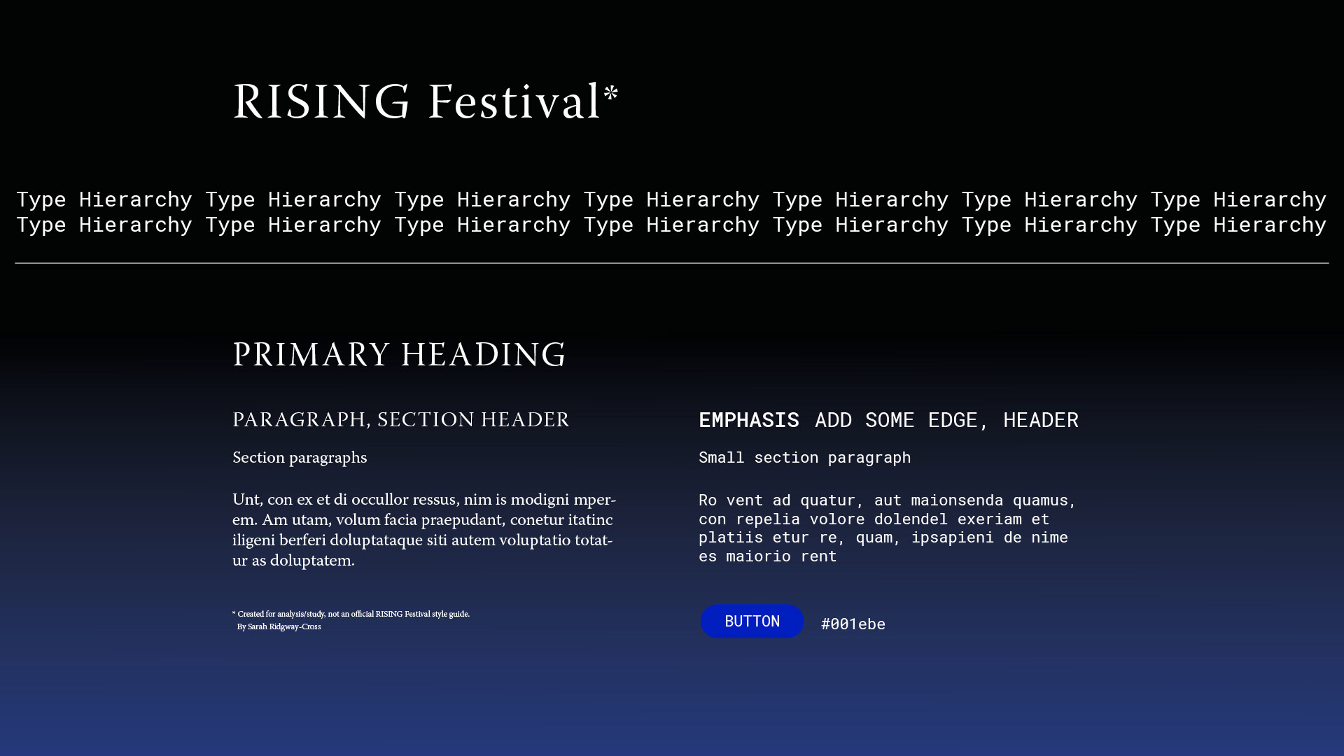
As usual, I started with research, filtering through photos and videos of the festival and reading reviews online. I began looking into the RISING festival branding - defining it as something somewhere between Co-Star and the Institute of Modern Art. I developed a type hierarchy (shown below) using Adobe fonts based on the RISING Festival fonts, Portrait and Söhne Mono.
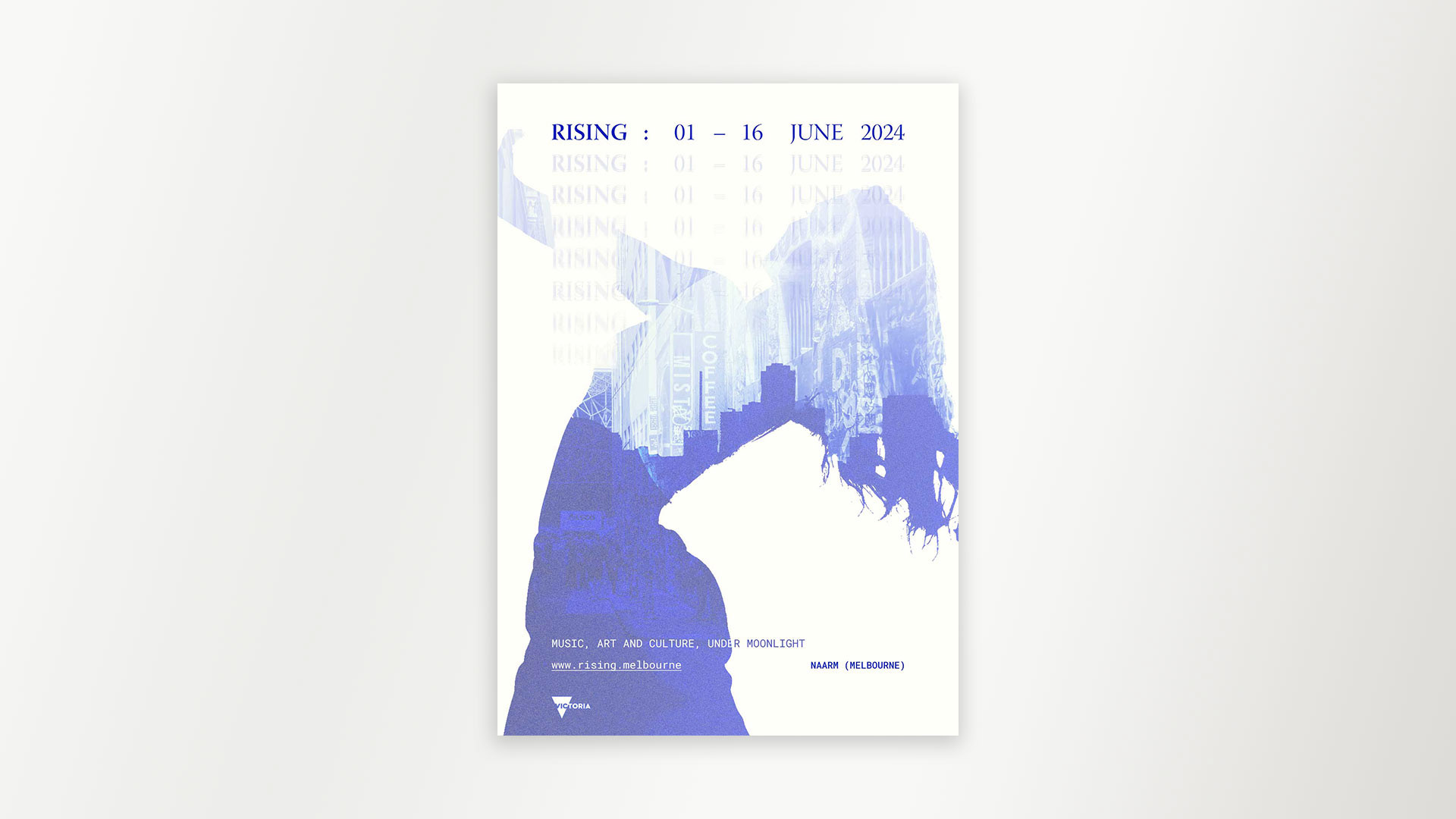
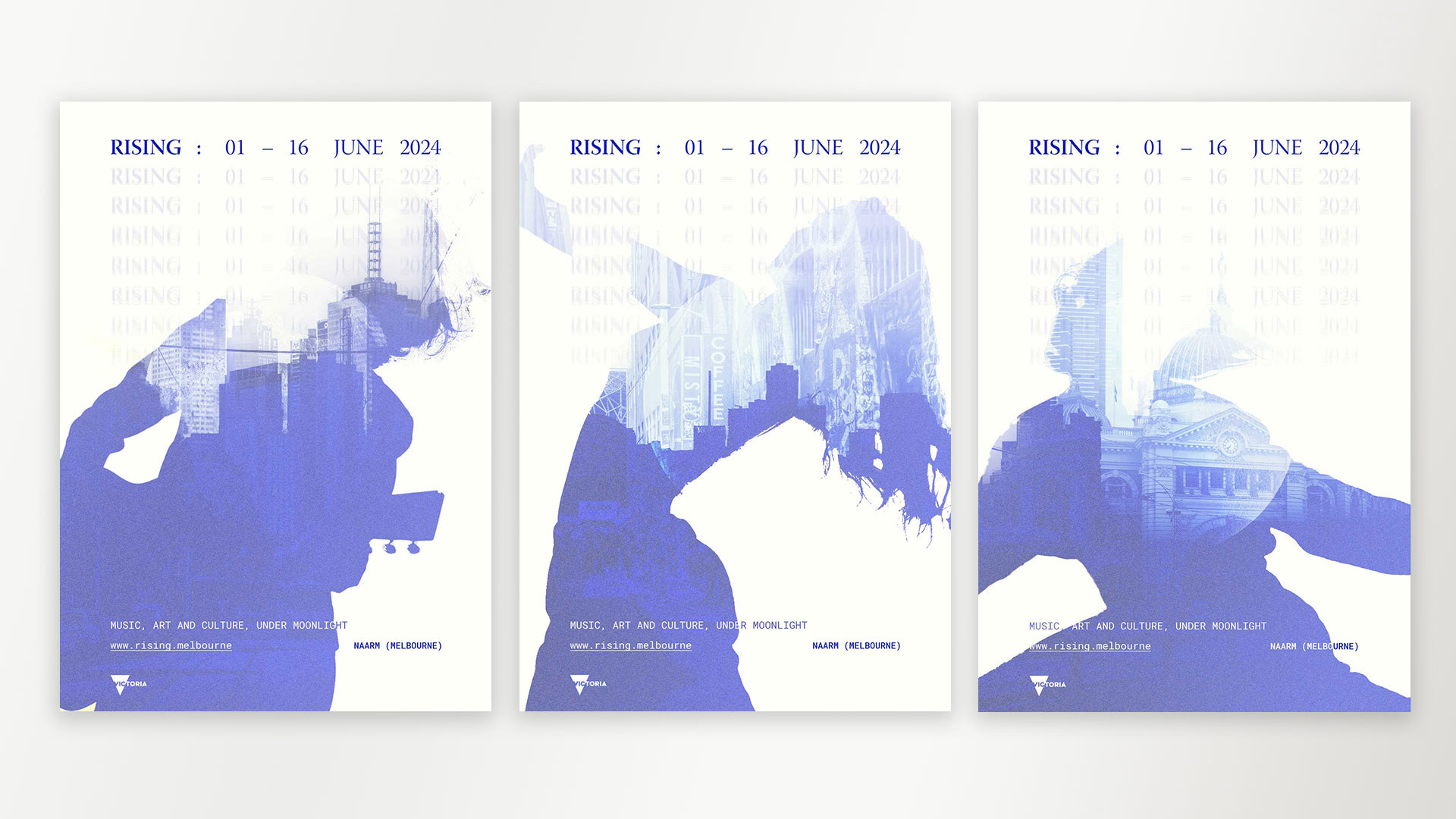
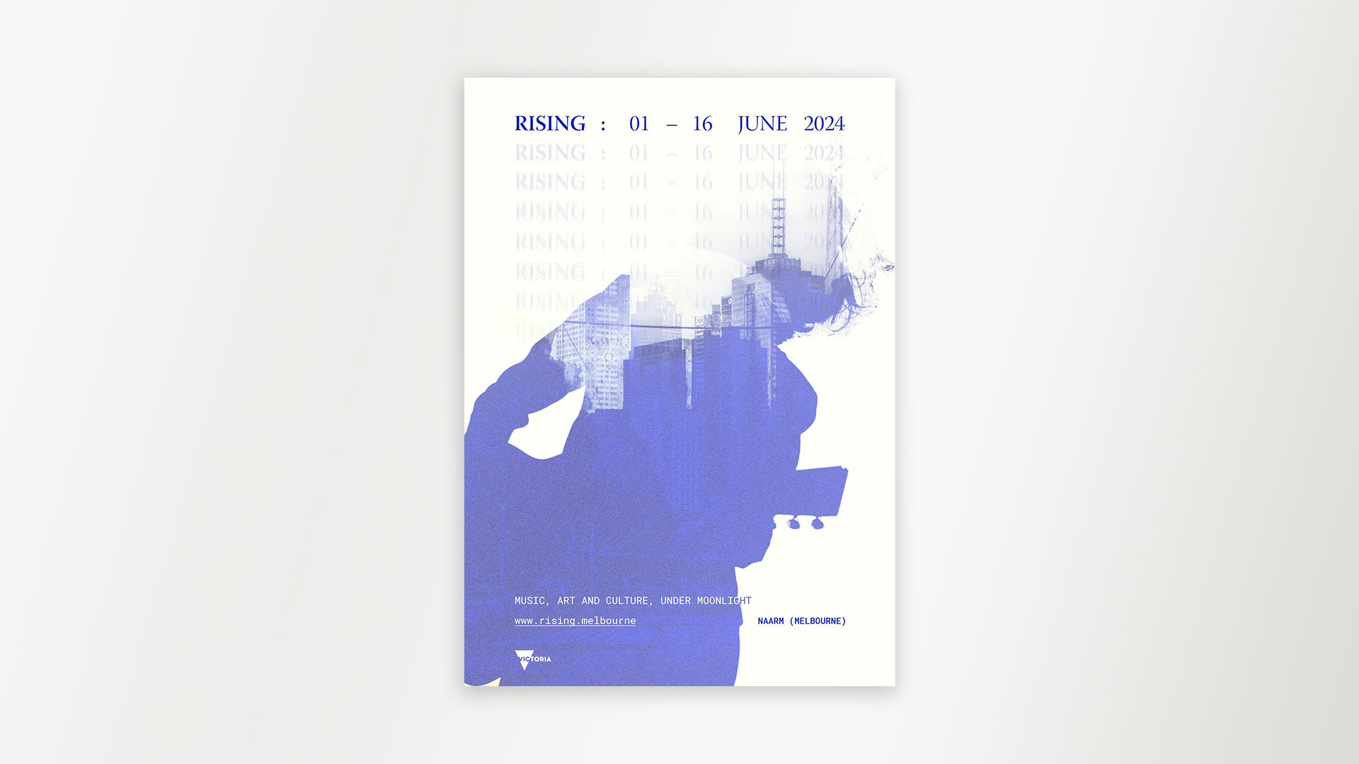
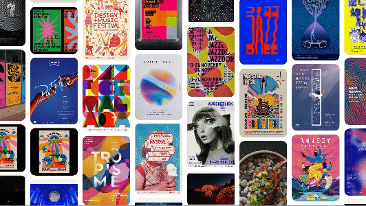
With enough background, I crafted a brief and collated images to represent the festival. With a particular feel in mind, I hopped onto pinterest and made a moodboard for the poster design (see below). I wanted to retain certain visual elements - the rising moon and the blue accent - while also communicating what the festival was about.
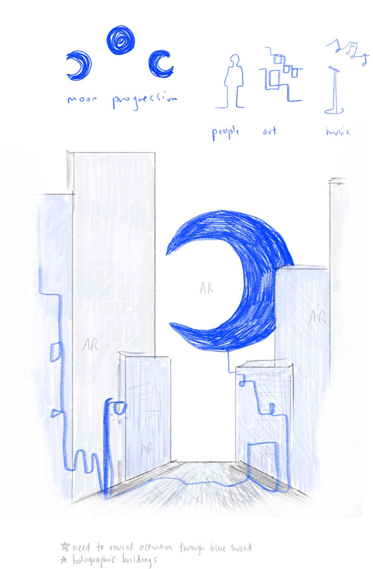
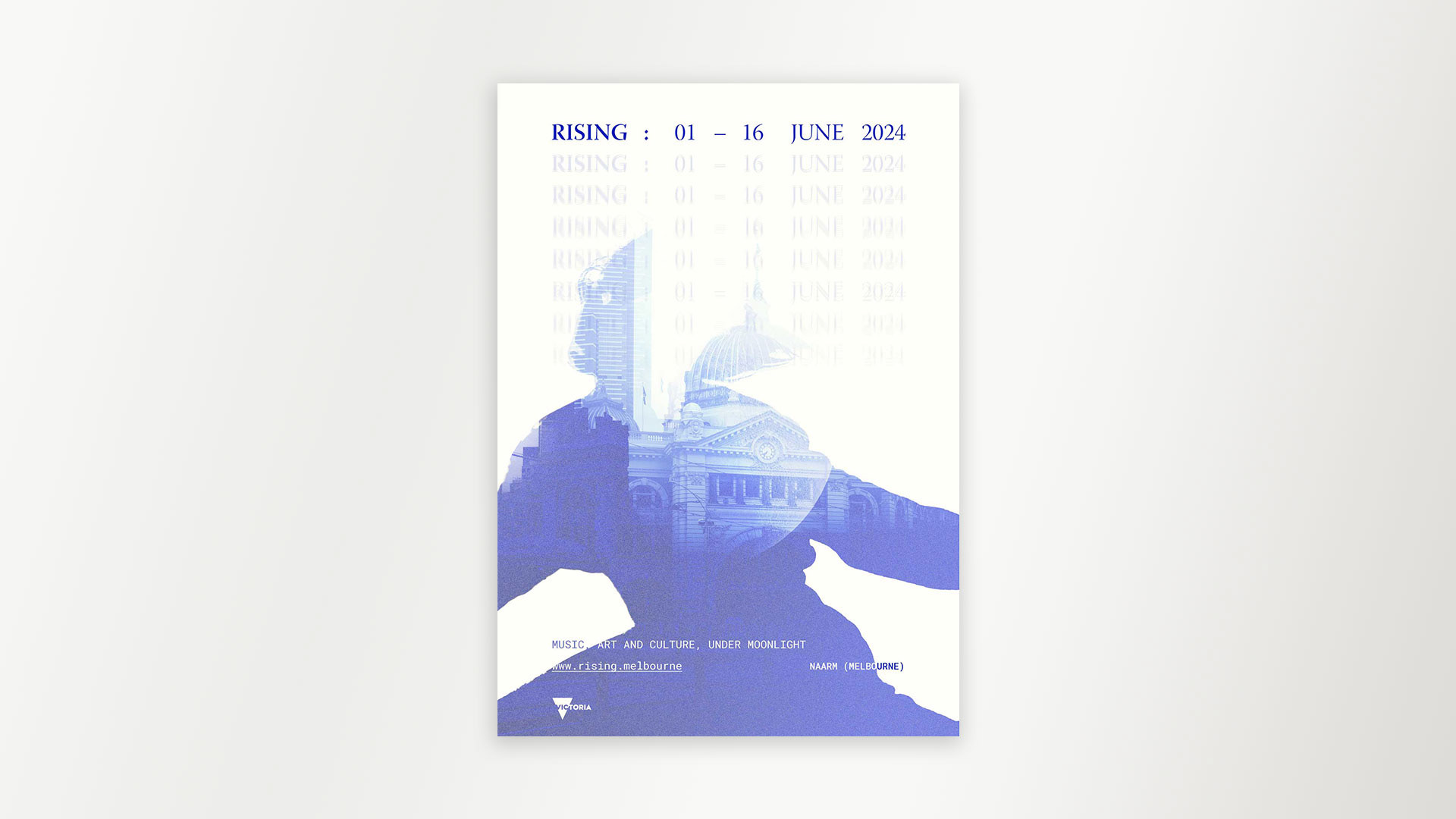
Before developing, I drew a generic design for the background of each poster (see above). I wanted to create three posters that could be displayed together, in different sequences, or individually. My visual priority was raising awareness about each event category while igniting curiousity and ultimately converting that into attendance. The demographic for the festival is broad - families, couples, individuals of all ages and backgrounds - and each event category naturally attracts certain groups of people, so I appealed to as many of them as possible. I designed the posters in Photoshop before preparing them for print in inDesign.