
Challenge
The show At its height, IRL is a riotous fever dream about young queer love and cosplay. However, there are scenes where characters touch on concerns about social media, capitalism, and the digital realm, giving the audience an overall feeling of being pulled between the analogue and digital worlds.
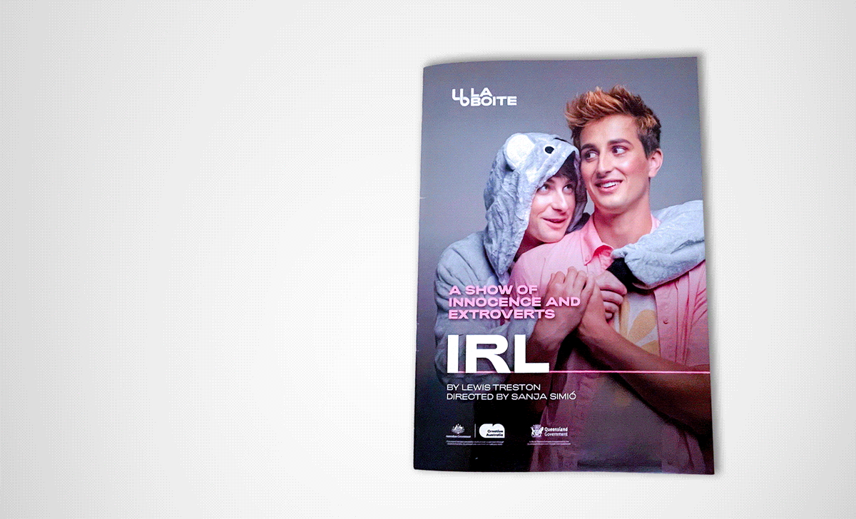
The artwork To remain in keeping with La Boite's branding, I opted for a friendly yet sleek design for the show. La Boite uses a monochromatic, minimalist, and bold brand style that conveys its position as an industry leader, particularly in developing new work. This style conflicts with IRL, a very bubbly and vibrant show. Finally, the Season 2023 branding, which adds line elements and a different text hierarchy, creates further visual requirements. Bringing these three styles together in a modern, visually appealing way was the primary challenge of the brochure and billboard.
Execution
The brochure La Boite branding is represented primarily through the types of shapes and lines used - I kept them sharp, distinct, and smooth. Over that foundation, I used colour and embellishments to portray the show's identity. Limiting the colour palette and including only shades of the show's designated colour (light pink) helped to create consistency across the pages.
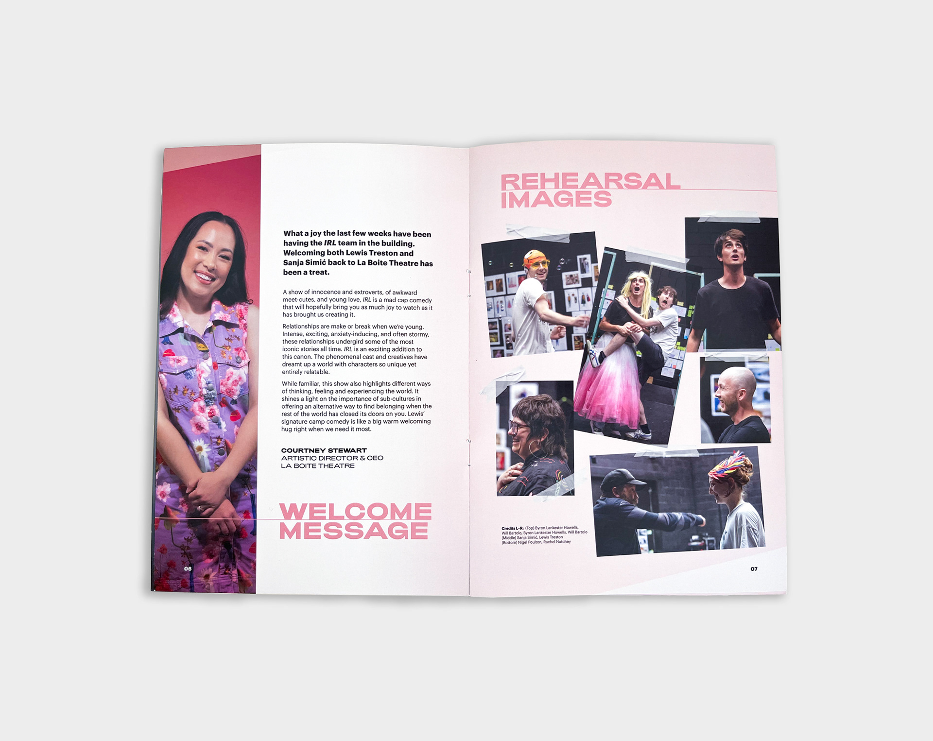
I chose a scrapbooking style for the rehearsal photos as a subtle nod to Y2K nostalgia and film photography to represent the relationships between IRL's characters, their life timelines, and their struggles with social media. The rehearsal photography was the only section where the show's brand became a greater priority than La Boite's. I enjoyed prioritising the show's style with the rehearsal images to reinforce the show's themes.
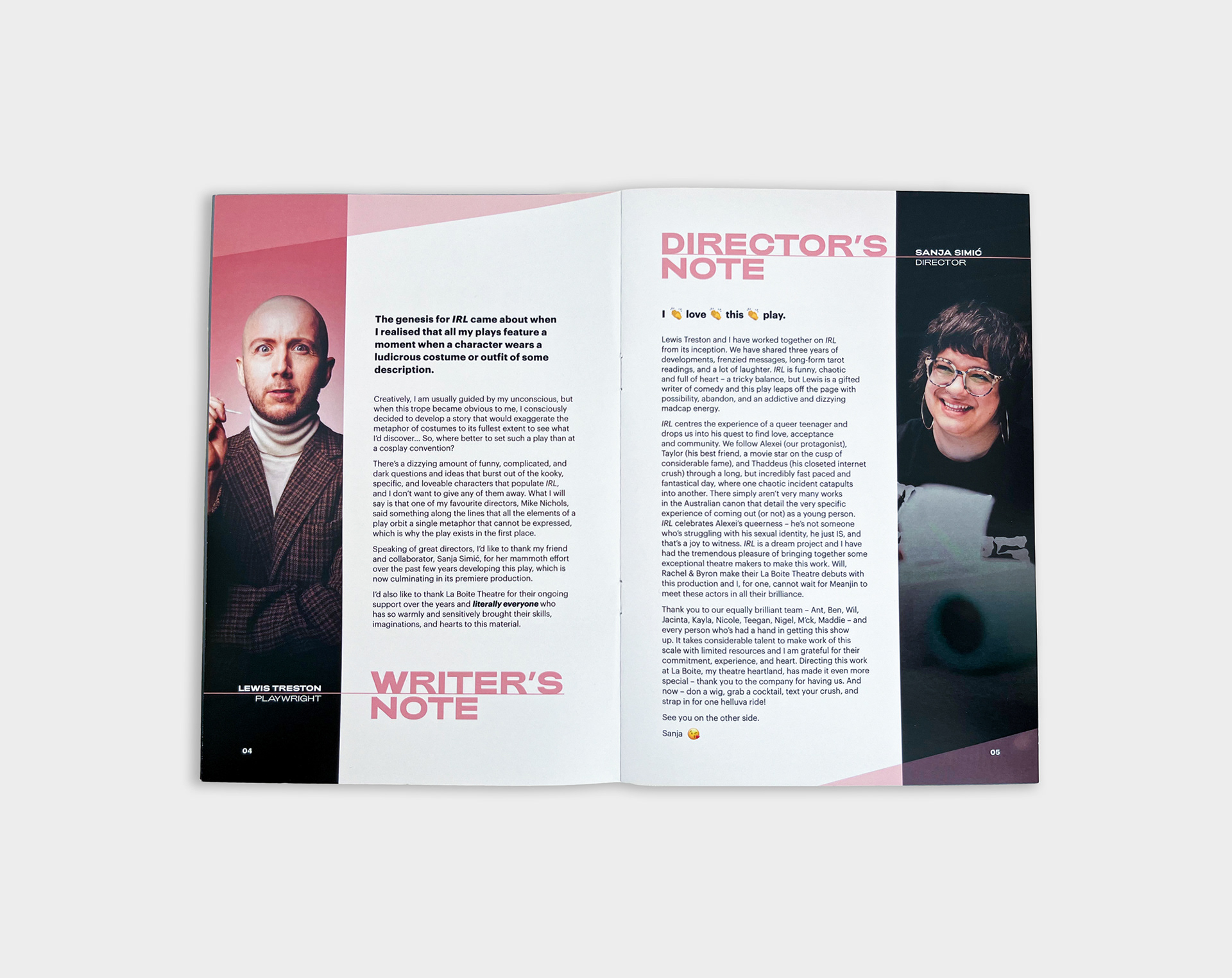
For any brochure, my priorities are ease of navigation across sections and pages, legibility, depicting the product's "personality" accurately, and cultivating a strong sense of visual cohesion.
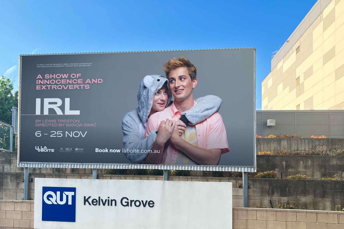
The billboard With its slightly tucked-away positioning on Kelvin Grove Road, I left-aligned the show information for ease of legibility by cars driving past on the left. I retouched the background to create contrast and add depth, and matched the costume pinks to the show's colour. Ultimately, I kept the design simple to create a clear salient point and a short reading path across the billboard.